Boston Interior Photographer | Boston Designer Show House 2017
The first thing I noticed when I walked into this year's Designer Show House was the COLOR! Not in your face, over the top color; beautiful, strategically placed, just-the-right-amount of color. What I love about this is how relatable it is. A well designed space has to be functional, but the icing on the cake that really ups the WOW factor is the aesthetics. We first walked into this impressive pink foyer designed by Cutting Edge Homes. It was the perfect way to kick off the home.
My friend Beth Daigle, of 3 Olives and a Twist, and I went to "press day" together, excited to get the first look. Before the ribbon cutting, I had the opportunity to photograph my friend and client, Kim Macumber's room. I was so excited for her and boy did she go for it - her green butler's pantry made this small space POP. My favorite part was the moss-padded petal sink by Thompson Traders.
Talk about green - THIS LIVING WALL. Can I have this in my home now please? Tess and Ted Interiors and Anavera Design worked together to make this room cozy, unique, and a one of a kind conversation piece. I don't think I'm alone when I say this room made me want to snuggle up with a blanket, book, and cup of coffee.
Yes to cool blues and purples in the gorgeous kitchen by Kelly Rogers
Mally Skok's colorful table setting in the dining room perfectly complimented the darker paint and hand-screened window treatments.
Nostalgia hit home hard for me when I walked into this bathroom by Linda Lyons with wall to wall Dutch tile. I lived in Holland for 6 months and this was a great nod to traditional Delftware.
Go see more photos over at Beth's blog! 3 Olives and a Twist
The Designer Show House is a must see and put on by the Junior League of Boston. Visit from now until November 5.
For more information, visit https://www.jlboston.org/2017-designer-show-house/
Boston Architectural Photographer | Decorators' Show House Part 3
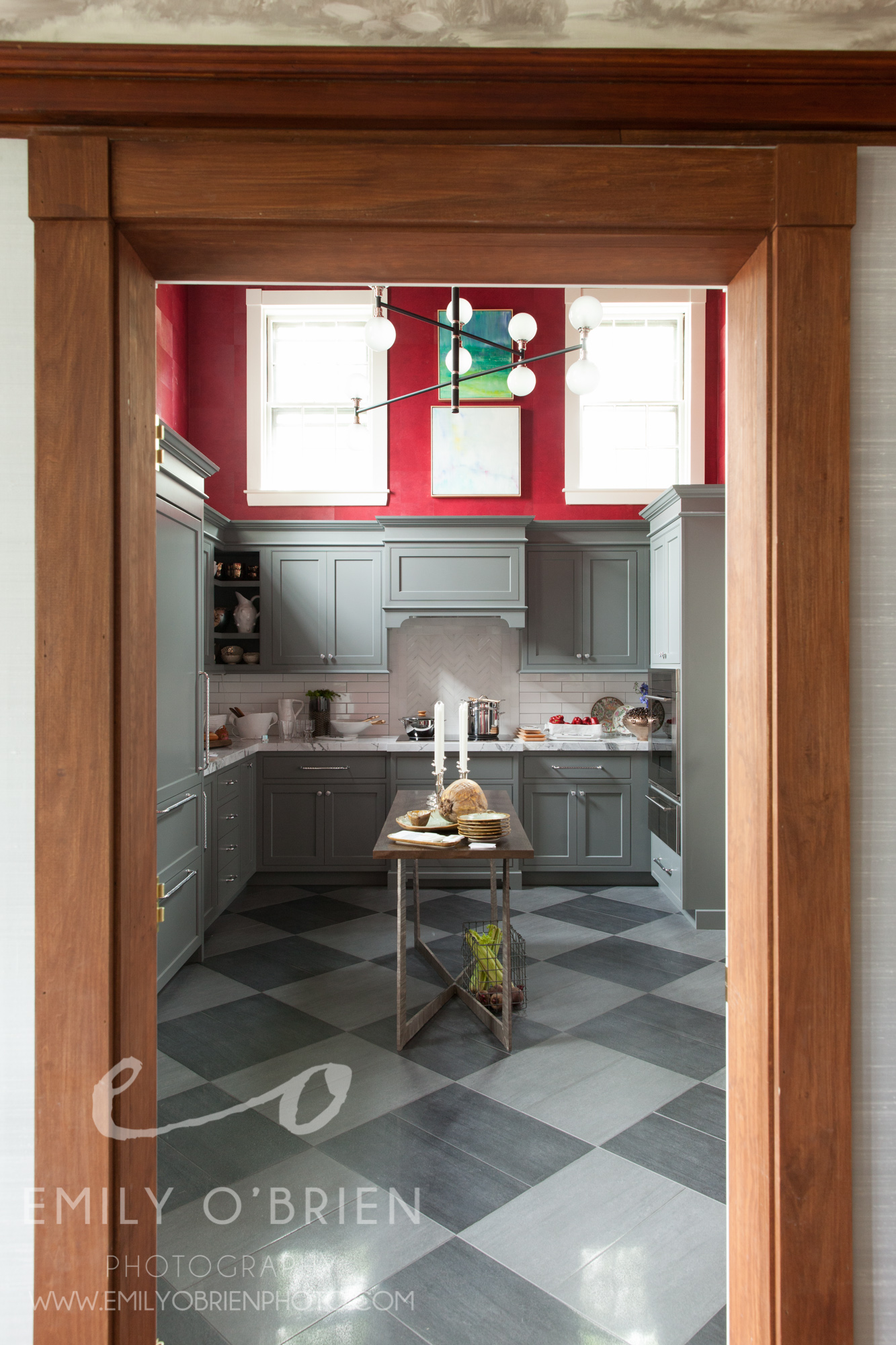
We are in the final days of the Junior League of Boston Decorators' Show House! We have covered a lot - The Receiving Room, The Grand Dining Room, The Morning Room covered by Beth Daigle, and the talk of the show, the magnificent Kitchen, covered by Kim Macumber.
I wanted to wrap up with a few of my favorite rooms from the upstairs. The Study, by Holly Joe Interiors, is exactly the home office I would love to sit in everyday. It is gender neutral, throwing in bits of masculinity with the leather chair and darker details, but brilliantly incorporates femininity with the plants and lighter elements like the glass table and floral window treatment. I LOVE the colors, I have always been draw to the cooler, calming color palette. The textured wall paper seems to be a theme, but I am really thrilled by how it works in this room, it makes me want to dress nicely to work here... maybe a farewell to the work-from-home-in-yoga-pants days?
My favorite bedroom is the "Lion, The Witch and The Wardrobe" by Sarah Scales. Do I love it so much for the name alone? Maybe, but when I was a little girl, I always dreamed of having one of those regal canopies that I saw in movies. I love that this one has such a fantastical feel, yet keeping it dark for obvious functional purposes. Then you look up into a starry night sky above, which is intricate beadwork all along the roof of the canopy. Gorgeous.
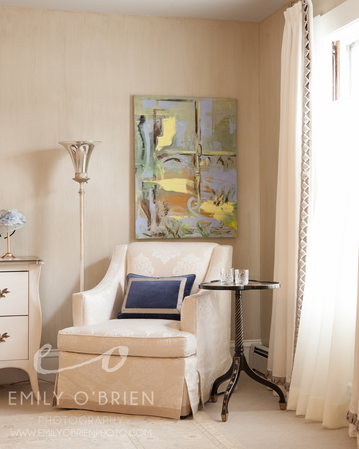
Lastly, The Master Bedroom, by Dibby Flint Design, is just beautifully classic and romantic. Simple and so, so elegant. This sitting area really drew all of my focus, and took over my imagination. I also loved to play dress up as a child, almost on a daily basis, and I can imagine myself playing dress up with vintage gowns and afternoon tea in this very spot.
Only 2 days left to check out the Decorators' Show House!
Check out more rooms from the Show House by Myself, interior designer, Kim Macumber and writer/editor, Beth Daigle
Boston Interior Photography | Junior League of Boston Decorators' Show House
If you haven’t been following along our tour through The Junior League of Boston’s Decorator Show House, you’ll want to start from the beginning! Click here to see our first post about Gerald Pomeroy’s stunning receiving room, then click here for writer and magazine editor, Beth Daigle’s take on the beautiful sunny Morning Room, designed by Theodore and Company. Finally, prepare to be wowed by Vani Sayeed’s red kitchen, covered by interior designer Kim Macumber.
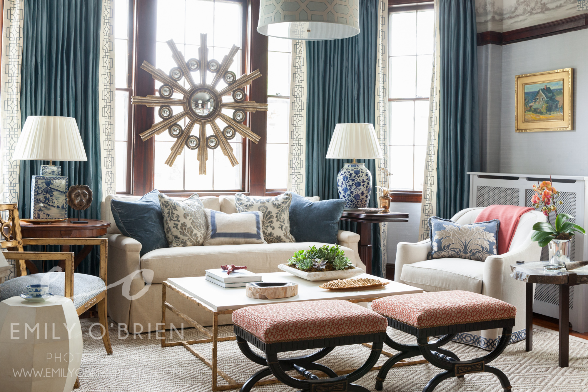
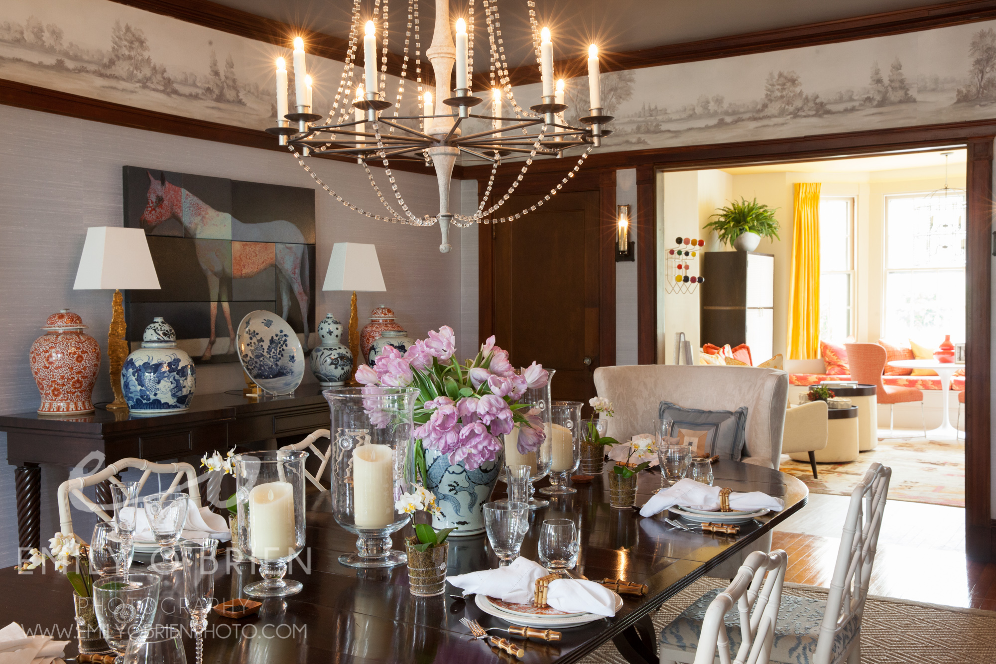
Onward! Today I’d like to draw focus to The Grand Dining Room that lies in the path between the kitchen and the morning room. There are a lot of things to love about this room, (the horse art piece for one), but my favorite is the walls! The woven silk sky-blue wall treatment adds texture, light, and contrast to the existing mahogany. Yet again, we are seeing hints of gold detail come out in this room, and I am loving the Chinese accents, like the porcelain vase shown below.
I am not an interior designer, nor would I ever think of putting an art piece smack in the middle of a window, but to my surprise, it works! If you look closely, you can see the spherical balls reflecting the entire room over and over. The cozy sitting area, perfect for daytime tea, or evening cocktails, is made all the more inviting by pillows and many textures. Can’t you just imagine a modern Chinese tea party here?
And look, it leads you right into the kitchen! (kitchen photo here)
Don’t forget to check back with Kim's blog from yesterday for a glimpse upstairs, and Beth’s from last week if you missed it.
Have a phenomenal long weekend!!! xoxo
The Grand Dining Room was designed by Theo and Isabella, to see more of their work, check them out at theoandisabella.com
The Show House is going on through June 5th, and you can purchase tickets for $35 at www.BostonShowHouse.org
Boston Architectural Photographer | Kim Macumber Interior Designer (Part 2)
My second shoot with Kim (see our first shoot here), was an entryway that she had designed for a client in Hopkington, MA. The first word that comes to mind when describing this entryway is “Grand”. It was certainly a grand, elegant, striking entryway. VERY different from our first project together, the red room. The doorway was an enormous dark wood door that led into a foyer area that clearly needed a beautiful design to compliment the door itself. Kim designed a round table in the middle, decorated with green, beige, and silver accent pieces of all different heights to compliment the immense height of the entryway itself.
Alternate view of entryway from the dining room. Kim also designed the bathroom in the background
This simple, muted tones are very different from most of Kim's projects, but she did manage to throw in some beautiful pattern to the bathroom, which is so true to her style. This project makes it so clearly evident that Kim is so in tune with what each space needs and how to style it to allow the space to shine.
Boston Interior Photographer | Southern Charm with a Colorful Twist
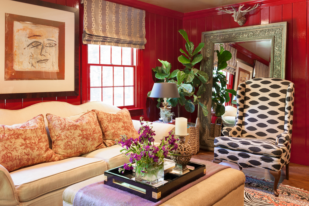
Kim is an interior designer who wanted to work with me. (woohoo!) She designed a high-gloss super-shine red room and wanted me to photograph it ::runs away screaming::
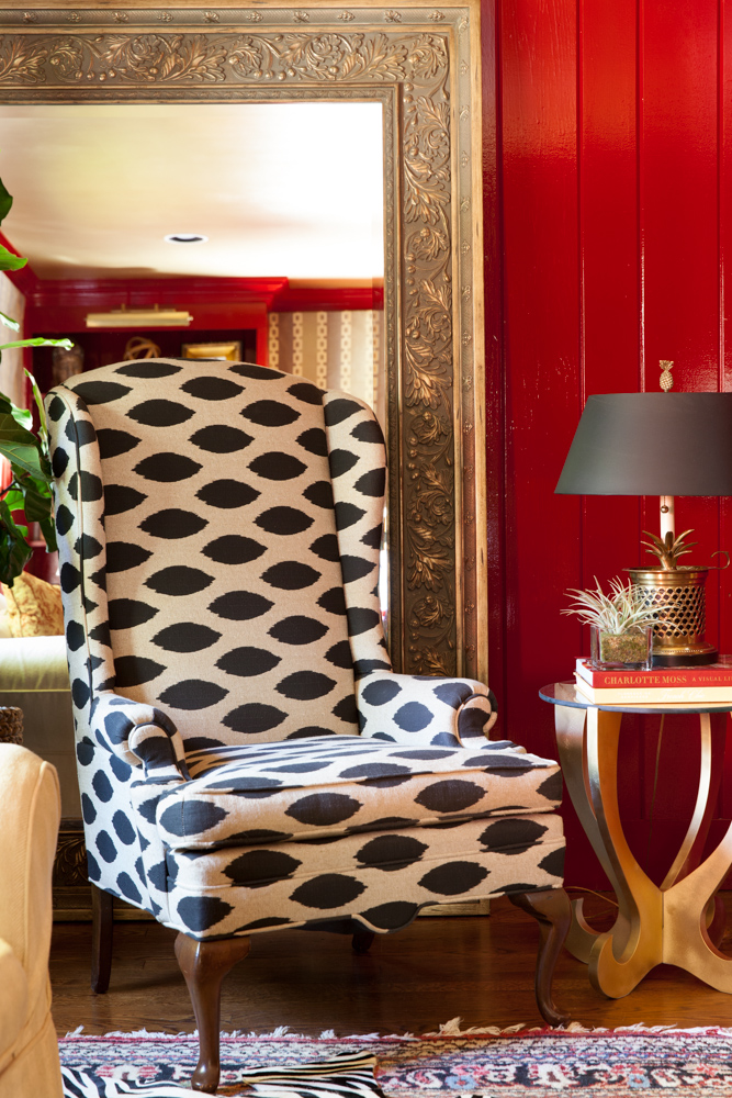
Joking aside, I am really glad I did answer the phone because Kim is so full of life and southern personality, I instantly couldn’t wait to meet her! OF COURSE she had to design a shiny red room with more texture and pattern than I had ever seen in one space. I had to stand there and take it in for a solid couple of minutes. It was so stunning, I was at first unsure how to capture it without just throwing on the widest angle lens I could find. The details and textures were SO important, and having so many of them certainly was a challenge, but with Kim’s expert styling, we slowly dissected the important features and captured the heart of the room.
View of the built-in bookshelf
Kim maximized color, texture, and pattern without making it look cluttered
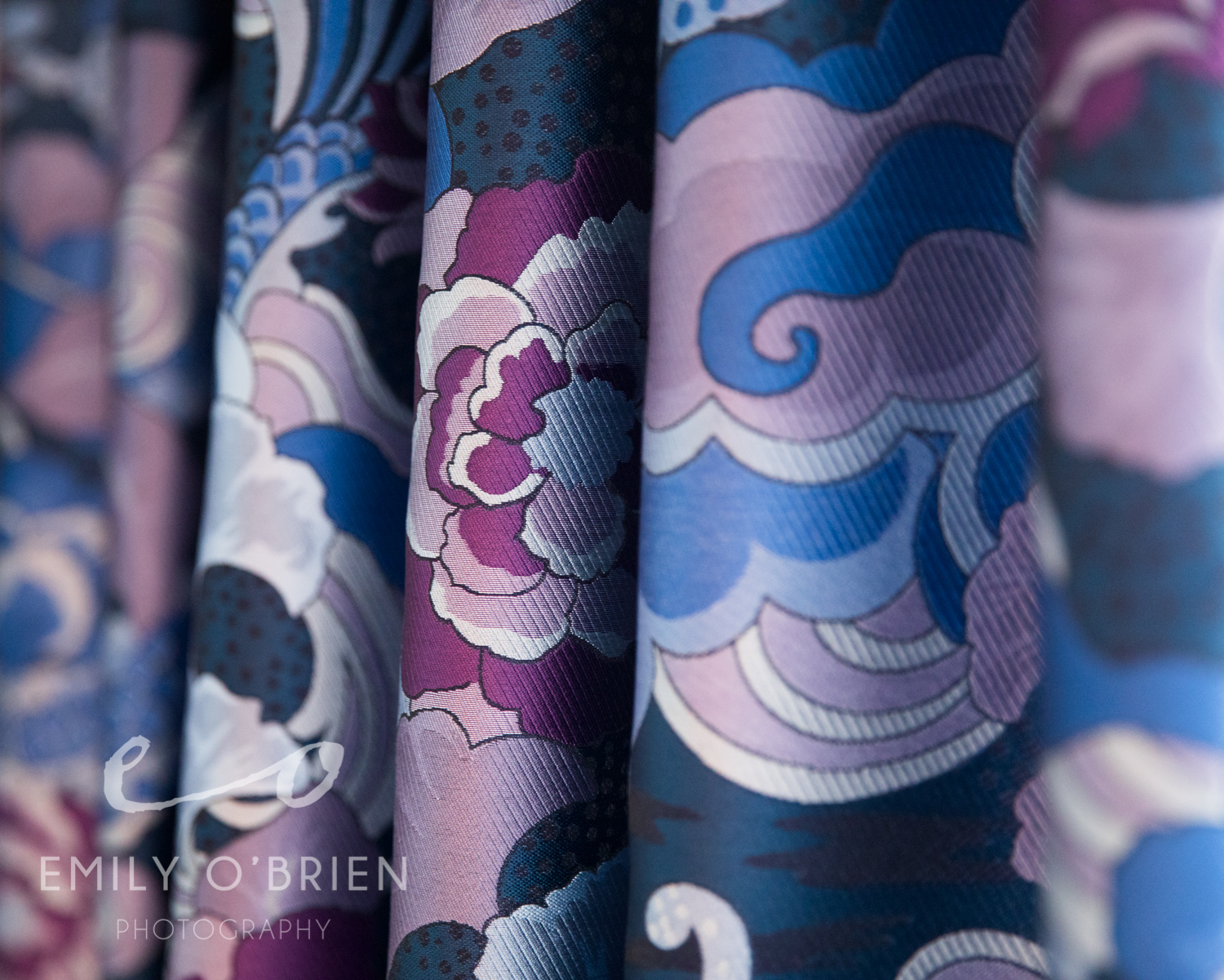
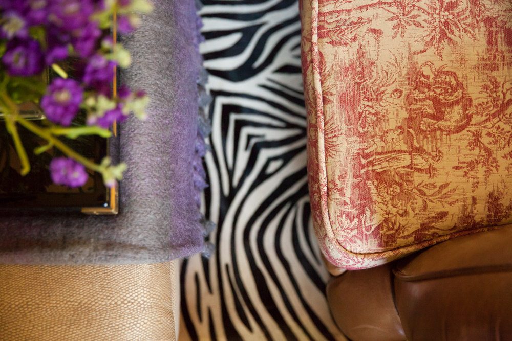
In the end, we realized we were missing a solid, yet simple detail shot. What detail could we possible photograph in this room that was as exciting as the rest of the room, but easy enough on the eye to fit nicely into the room’s portfolio? Problem solvers that we are, we grabbed the most dominant patterns and textures, and layered them on top of each other to create something of a “mood board” for the rest of the room.
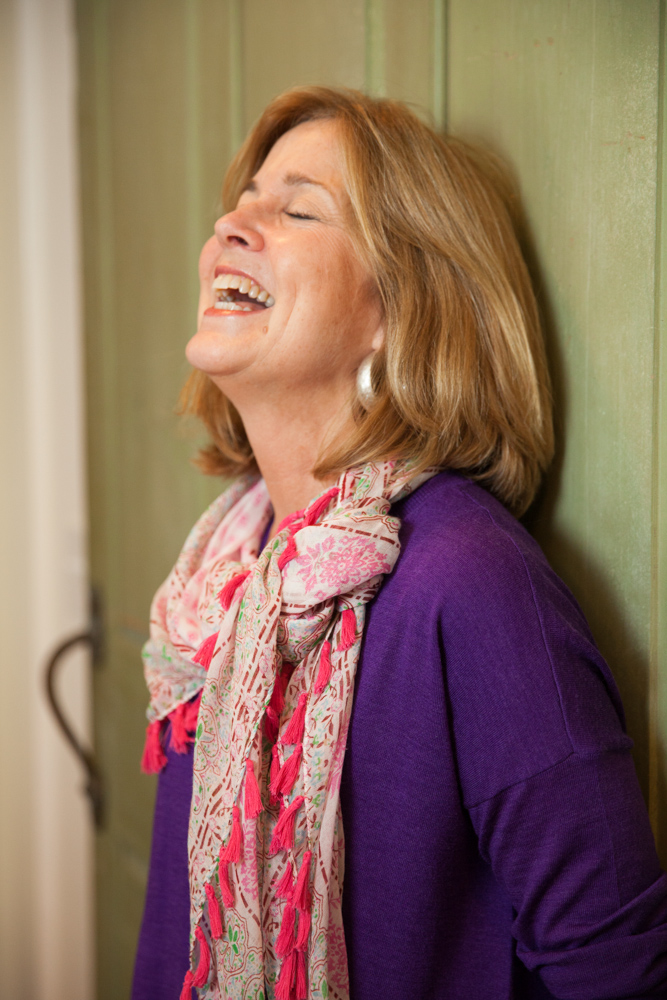
We did some portraits of Kim too for her new website, and I love how this one really shows off her fun personality
A Mutual friend, and interior designer, Linda Holt, referred me to Kim, and I am over the moon that she did, because Kim’s work is so unique and versatile, it really kept me on my toes as a photographer! The next shoot with Kim coming up!
You can see more of Kim's stunning work here


