Merrimack Valley Home Issue | What Went Into Capturing the Beautiful Interiors, Plus 3 Bonus Photos
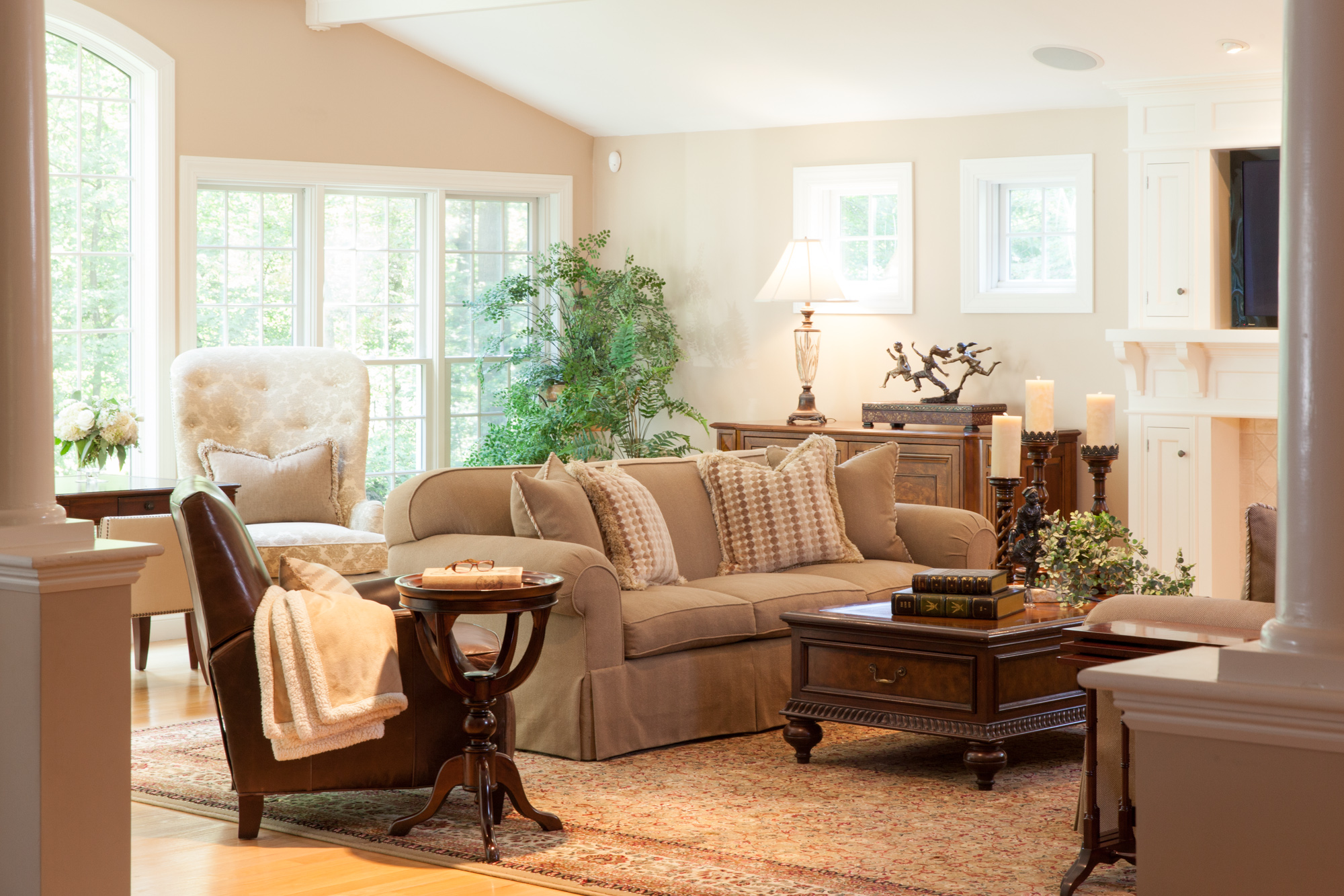
I love photographing beautiful interior design. “This issue may be the cover, so keep that in mind when shooting.” This was exciting to hear going into my second home photo shoot for Merrimack Valley Magazine. I was already thrilled to be working on this shoot with Beth Daigle and Linda Holt, so when I arrived and saw the interior of the home we had the privilege of photographing, I died a little inside [in a good way]. There was something very traditional about the decor, but simplified with use of color and modern elements.
Not many people know that Linda used to be a photographer, but it was a real treat to have her eye for design AND photography on this one. You may be thinking there is a chance that two photographers working behind one camera could be a competitive disaster… and in some instances I’m sure that would be the case. Linda and I were on the same page from the beginning and it was immediately a strong partnership working toward the same goal, noticing similar details, and playing off each other’s suggestions. It especially doesn’t hurt to have an extra set of eyes looking out for and understanding how the natural light will photograph.
We spent most of the day dancing around our “cover” shot because the light wasn’t just right, but when it was… ohhh it was.
I think we were also lucky that Sandy, the homeowner was such a gracious host to us. Now because Linda, Beth and I were on a tear, scrutinizing every detail, this meant lots of tweaking and furniture rearranging. Sandy’s furniture is beautiful… and heavy, very heavy. She didn’t mind us moving it around to get a good shot, so of course we decided to move the heaviest piece of furniture in the house {the solid wood coffee table}. Sandy’s husband came home toward the end, and being the gentleman that he is, moved the furniture back into place for us after… lucky us.
Here are some shots that didn't make the issue. If you haven't already, pick up a copy of the issue to read the full article by Alyson Aiello.
The white cabinetry against the dark wood gave an old country feel with an updated twist
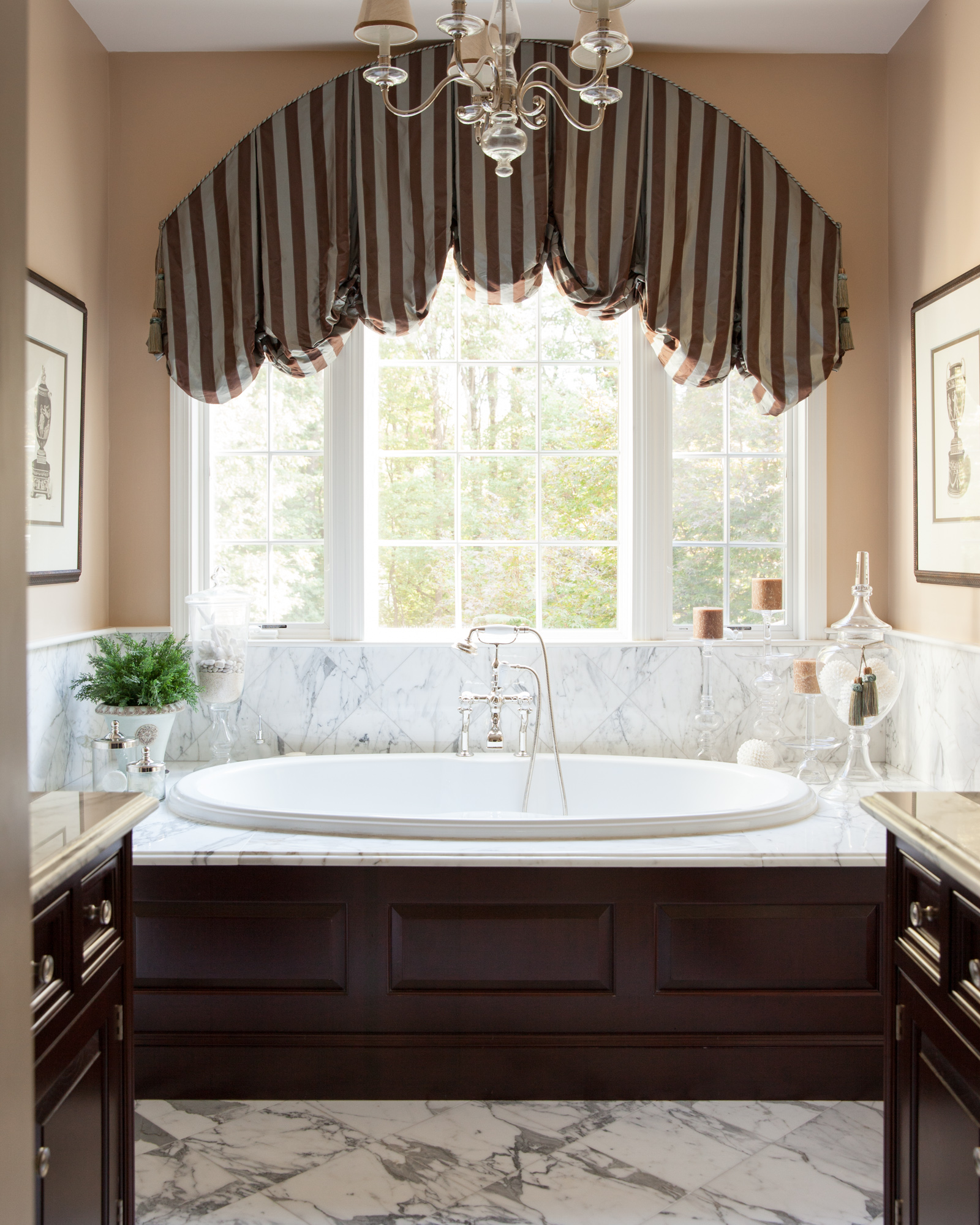
Marble back splash to match the marble floor, against dark wood made quite an impact next to the pristine white whirlpool tub.
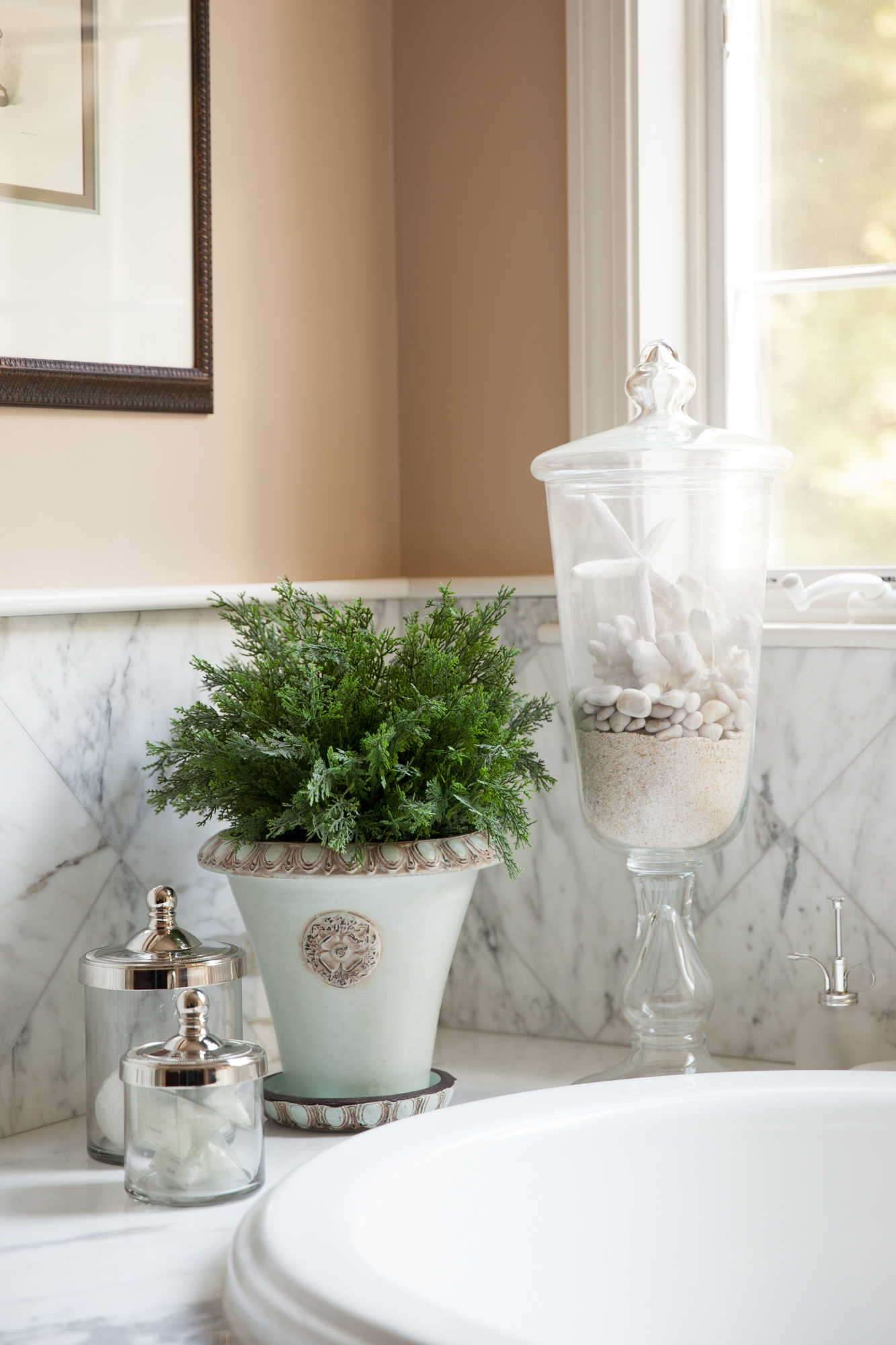
Color details add to the soothing environment


