Boston Portrait Photographer | Merrimack Valley Magazine
Merrimack Valley Magazine shoots are always a great creative outlet. Lysa Pelletier is an incredible stylist and we’ve never been disappointed by her vision. Having her and Stephen on set is the perfect balance of collaboration, and while we are always shooting for a specific layout, we get just enough creative freedom to play around a bit too.
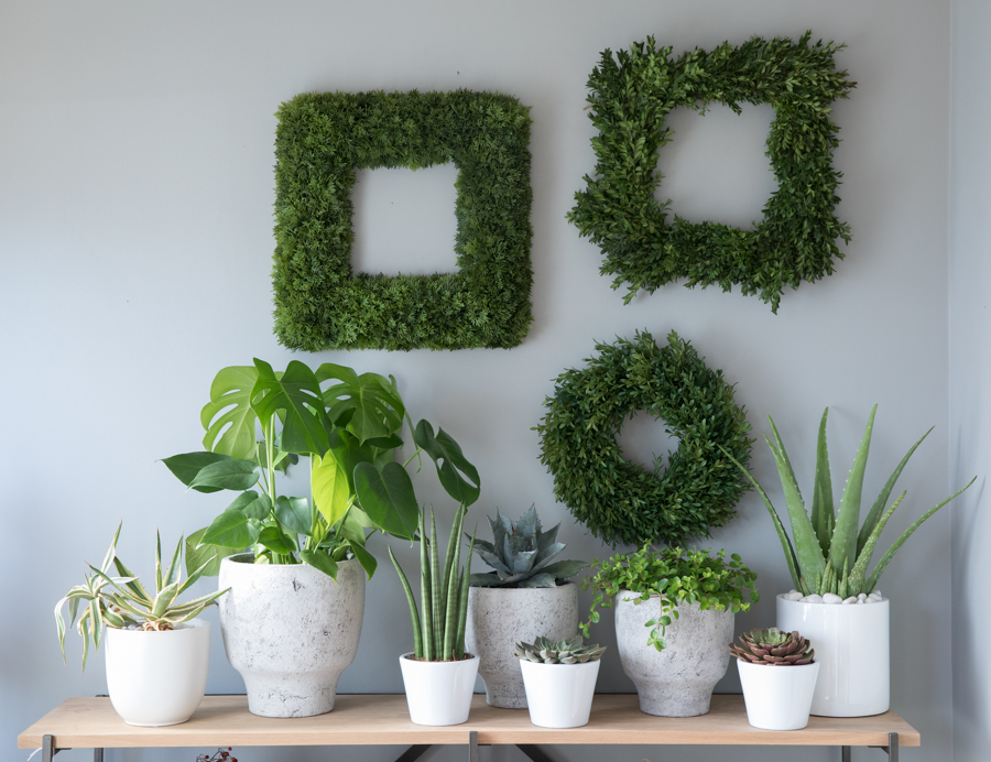
We shot at Sage Market and Design, located in downtown Newburyport, and their showroom is stunning. With big windows opening up the room to the bay, the exquisite pieces are showcased with beautiful natural light overlooking the water. Focusing on the idea of including greens in your home during the winter months, we naturally gravitated to the wall of greenery.
Sage’s unique pieces popped against the lush backdrop. Moving on with our theme, we continued using natural elements in the dining room table shot. We love how Lysa styled the smooth tableware, the natural edges, and the plush fur for the tablecloth.
We always have a lot of fun on these shoots, and that is because of our team. Everyone pitches in, everyone has a voice, and no one takes it too seriously... unless they are making sure I don't fall when I am dangling from a ladder. These are some of the images that didn't make the cut, but make sure to pick up the January issue to see our favorites that did make it in the issue.
Lysa Pelletier is represented Anchor Artists
Merrimack Valley Home Magazine | French Decor and Les Fleurs
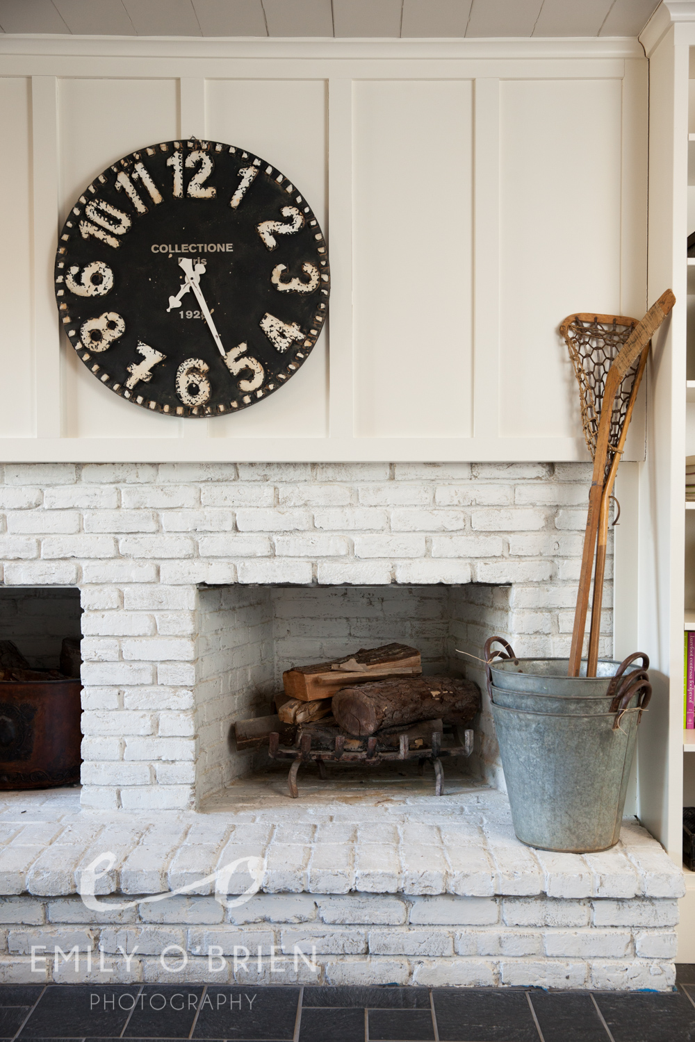
Our most recent photo shoot for Merrimack Valley Home Magazine featured the home of Sandra Sigman, owner of Les Fleurs in downtown Andover. I guess it’s to be expected that the greenery and flowers in her home would be outstanding, but the interior design work throughout her home was truly awe-worthy. Right on Lake Cochichewick in North Andover, her home feels like you are walking into an editorial spread, which of course is WHY we were shooting there for the spring issue.
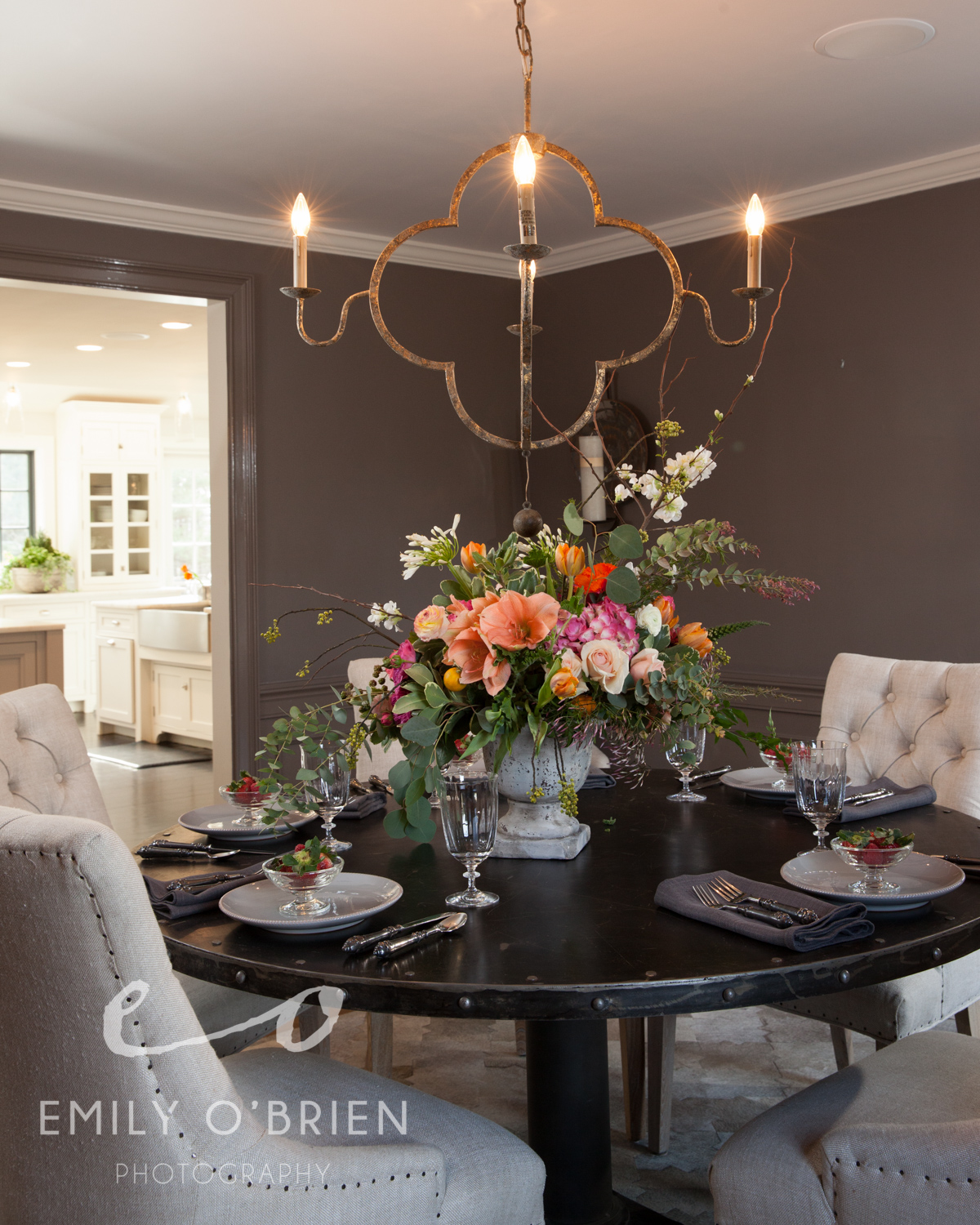
Our focus was her Paris-inspired dining room when shooting there, but her whole home had beautiful rustic French accents. The big light colored chairs and delicate accessories were the perfect compliment to the rich wood and darker tones of the room. Read more about her home in Linda Holt’s article in the Merrimack Valley Home issue, on newsstands in the Merrimack Valley now.
Oh, and those incredible floral arrangements you see? Sandra's “flower shop”, Les Fleurs, isn’t your typical little florist. You walk into the store, and feel like you are walking into an Anthropologie catalogue. The first time I walked in, I immediately wanted to redecorate my home with earth tones, burlap, barn wood, and of course, interesting plants. They have a consultation room that I wish was my dining room (can I take that farm table home with me please??)
Les Fleurs specializes in creating floral arrangements for weddings, events, and homes. They always have the best seasonal arrangements and rare finds for the home and garden.
Merrimack Valley Home Issue | What Went Into Capturing the Beautiful Interiors, Plus 3 Bonus Photos
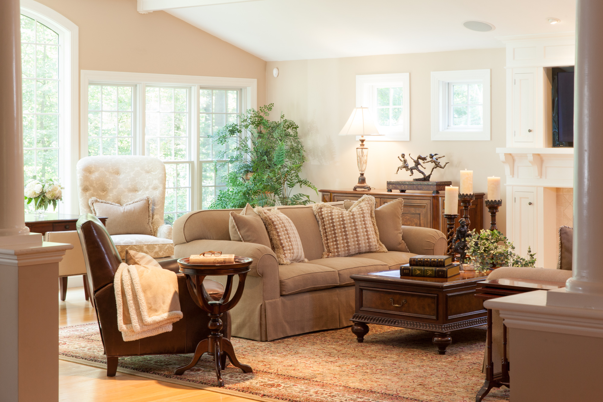
I love photographing beautiful interior design. “This issue may be the cover, so keep that in mind when shooting.” This was exciting to hear going into my second home photo shoot for Merrimack Valley Magazine. I was already thrilled to be working on this shoot with Beth Daigle and Linda Holt, so when I arrived and saw the interior of the home we had the privilege of photographing, I died a little inside [in a good way]. There was something very traditional about the decor, but simplified with use of color and modern elements.
Not many people know that Linda used to be a photographer, but it was a real treat to have her eye for design AND photography on this one. You may be thinking there is a chance that two photographers working behind one camera could be a competitive disaster… and in some instances I’m sure that would be the case. Linda and I were on the same page from the beginning and it was immediately a strong partnership working toward the same goal, noticing similar details, and playing off each other’s suggestions. It especially doesn’t hurt to have an extra set of eyes looking out for and understanding how the natural light will photograph.
We spent most of the day dancing around our “cover” shot because the light wasn’t just right, but when it was… ohhh it was.
I think we were also lucky that Sandy, the homeowner was such a gracious host to us. Now because Linda, Beth and I were on a tear, scrutinizing every detail, this meant lots of tweaking and furniture rearranging. Sandy’s furniture is beautiful… and heavy, very heavy. She didn’t mind us moving it around to get a good shot, so of course we decided to move the heaviest piece of furniture in the house {the solid wood coffee table}. Sandy’s husband came home toward the end, and being the gentleman that he is, moved the furniture back into place for us after… lucky us.
Here are some shots that didn't make the issue. If you haven't already, pick up a copy of the issue to read the full article by Alyson Aiello.
The white cabinetry against the dark wood gave an old country feel with an updated twist
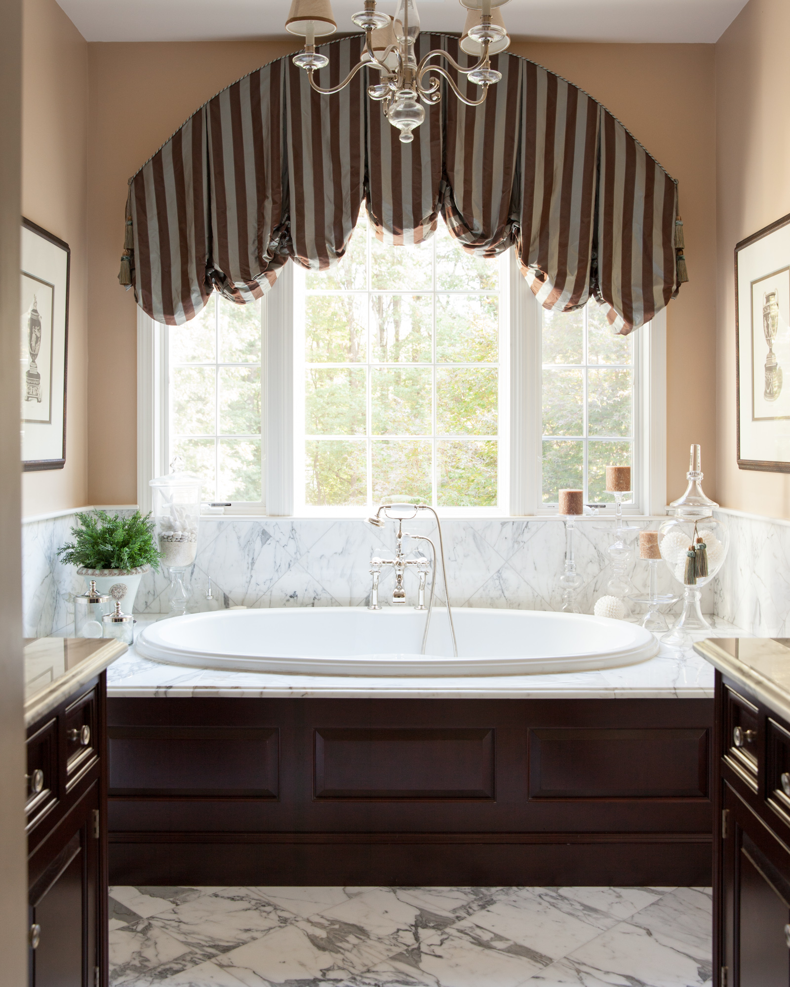
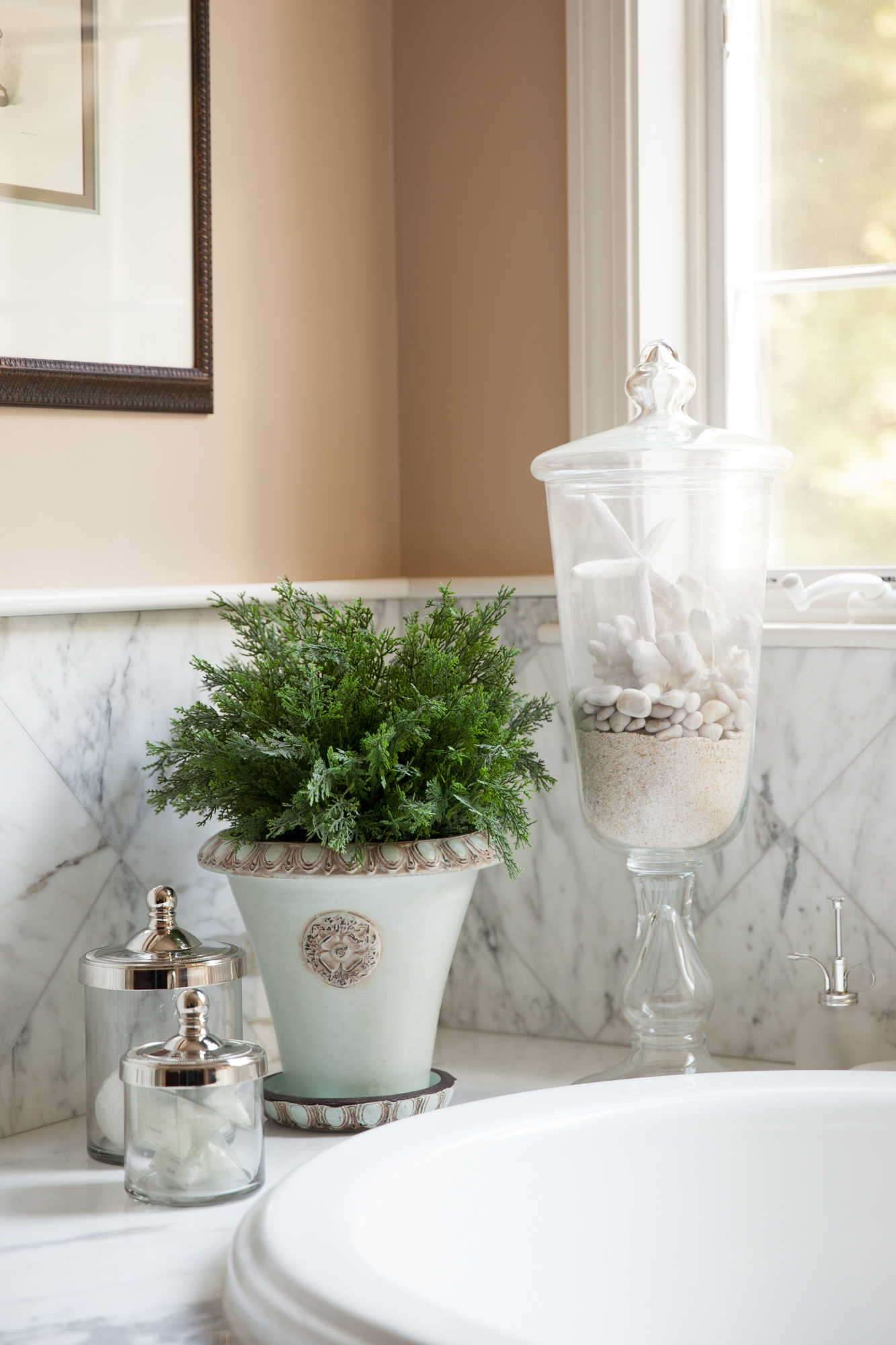
Marble back splash to match the marble floor, against dark wood made quite an impact next to the pristine white whirlpool tub.
Color details add to the soothing environment


